Digital rebranding project
Goals:
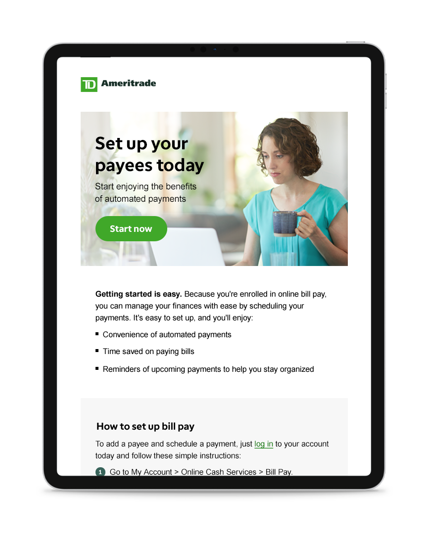
Rebrand TD Ameritrade to have a more consistent and approachable voice and visual identity across products and platforms.
Target audience:
TD Ameritrade’s investment and retirement clients
Role:
I worked as an email developer and designer. The company undertook a large scale rebranding project, and I worked on a cross-functional team to roll out the new style across platforms.
In addition to coding and designing emails, I adhered to ADA compliance, edited photos, made the designs responsive, created landing pages, animated an html5 ad campaign in collaboration with Google, and did some print work as well.
I built on my coding and design skills, tested email campaigns and ensured they were ready for deployment. Overall, it was a great learning experience.
Outcome:
Rebranding project was a success, and hiring me to do email coding in house saved the company a large amount of money.
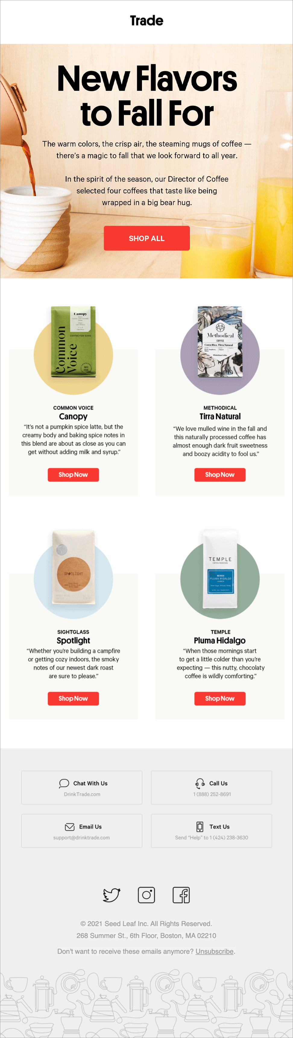
In 2021, I worked as a digital designer at Trade creating ads, emails, modals, on site experiences and print work. Here’s a sampling of some of the projects.
Graphic design and illustration for Splashe, an eco-friendly beauty online marketplace
Goals:
Refine Splashe’s brand identity and connect with a larger audience on Instagram, Facebook, and Pinterest.
Target Audience:
Environmentally-minded beauty enthusiasts
Role:
I’m working as a digital designer on a small marketing team to create illustrations, social posts, banners, email flows, animations, and ads for social.
One of my favorite projects so far has been an illustration series in honor of International Women’s Day featuring Ruth Bader Ginsburg, Maya Angelou, Frida Kahlo, Malala Yousafzai and Margaret Thatcher.
Global branding for Sugar Lips
Goals:
Introduce new lip products to a global market
Target Audience:
Beauty enthusiasts
Role:
At Fresh, I worked as a graphic designer on the global branding team, assisting with the roll out of a rebranding project across their Sugar Lip product franchise. Additionally, I helped establish a new branding and style guide.
I created designs for US and International markets, including the hero images for the Sugar Orchid and Sugar Mint campaigns as well as social media posts, emails, light boxes, and in-store merchandising. Sugar Orchid and Mint were new products launched in 2019.
Process:
I collaborated with other team members to ensure a consistent look and implementation across franchises within the Fresh brand.
Stationery Collection for Minted
For sale here
Target Audience:
Newly engaged couples, newlyweds and families
Process:
I love to create wedding invitations and holiday cards that help to celebrate important moments.
For these pieces, I was inspired by fresh water pearls, water and woodgrain textures, baby's breath flowers, and typography from old 1940s issues of Vogue.
Using my visual inspiration as a jumping off point, I started by making pen and ink drawings and watercolor washes. I digitized my pen and inks, turning them into foil-pressed design elements, and then I paired them with typography and original copy.
Outcome:
Collection has reached approximately 800,000 households since 2016
Roles:
Designs and illustrations by Julia Hall
Photos by Minted
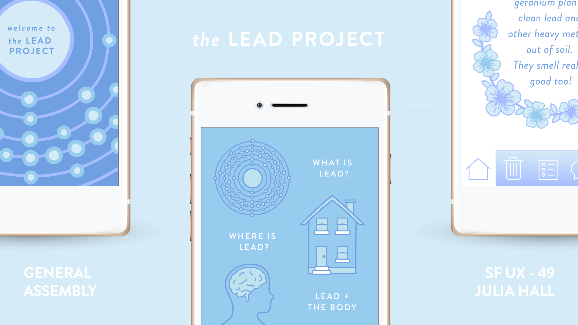
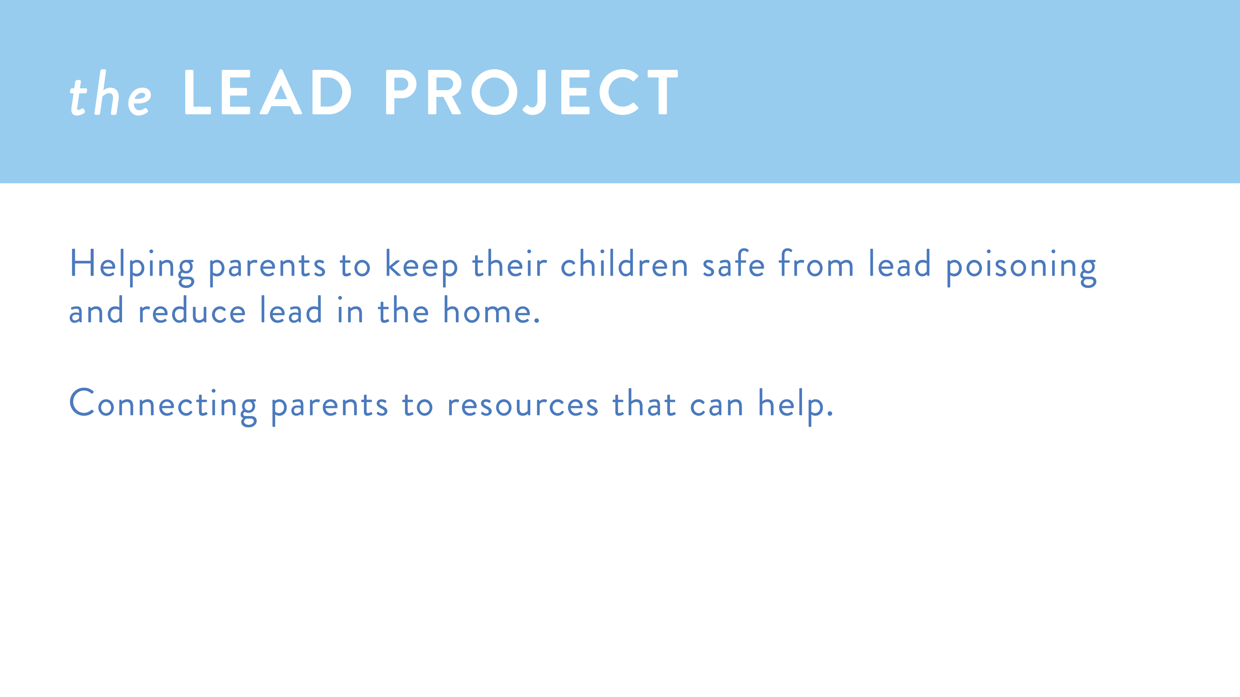
the Lead Project is an instructional cleaning app to reduce lead dust in old homes
Goals:
The Lead Project was developed to help parents reduce lead in their homes and get community support if their children test positive for lead poisoning.
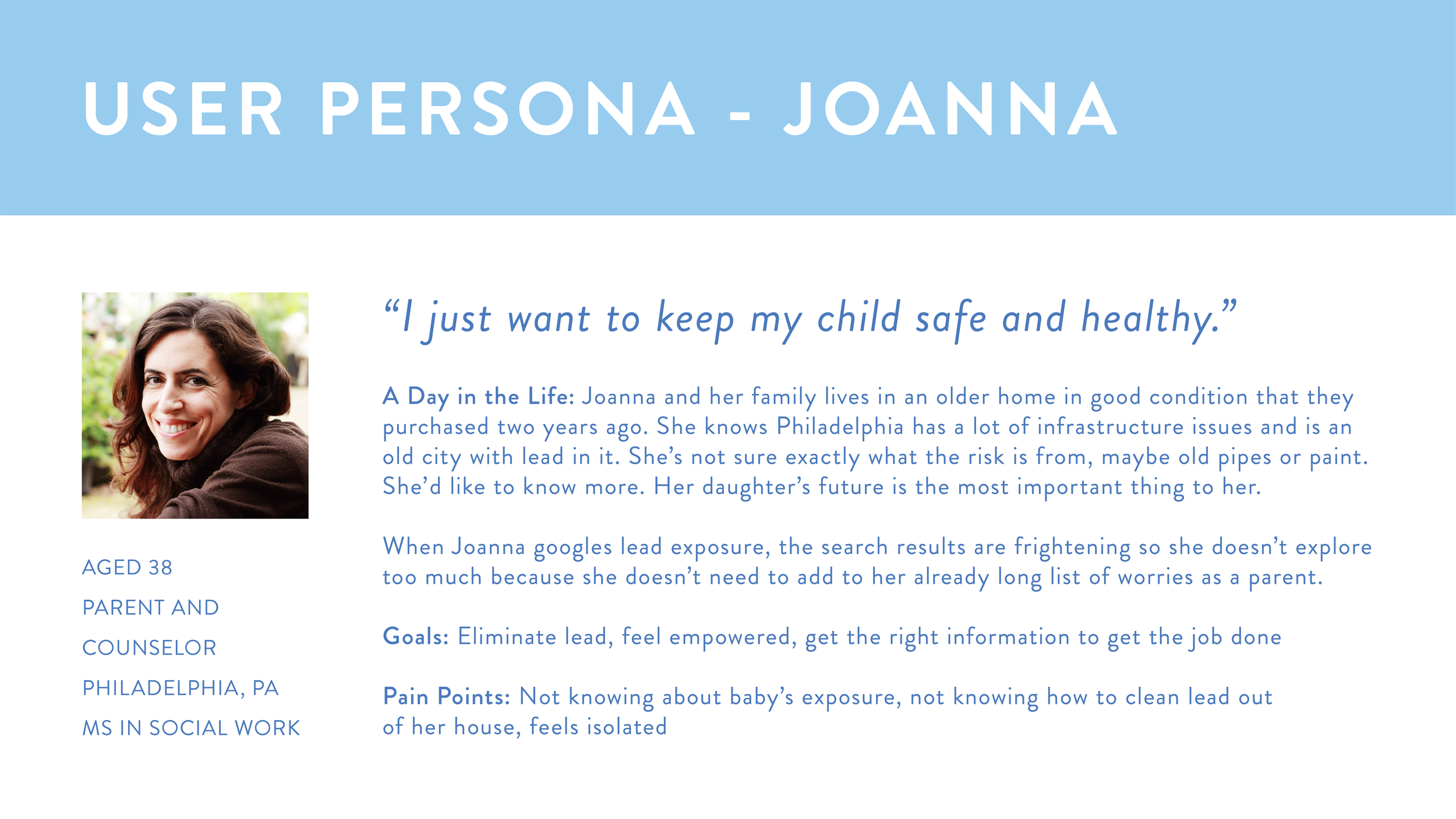
Target users:
Parents and other care givers
Design Process:
I was initially interested in making a lead reduction tool after working in public schools in Philadelphia.
Several school buildings didn’t have potable water because the pipes contained lead. Even though the students didn’t drink the water, they still washed their hands and came into indirect contact with the water throughout their days. This bothered me, and I knew I wanted to do something to help reduce lead exposure somehow.
My research led me to focus in on the home environment because I would be able to limit the scope of the project and concentrate on actions individuals could take immediately that wouldn't involve the need for systemic change.
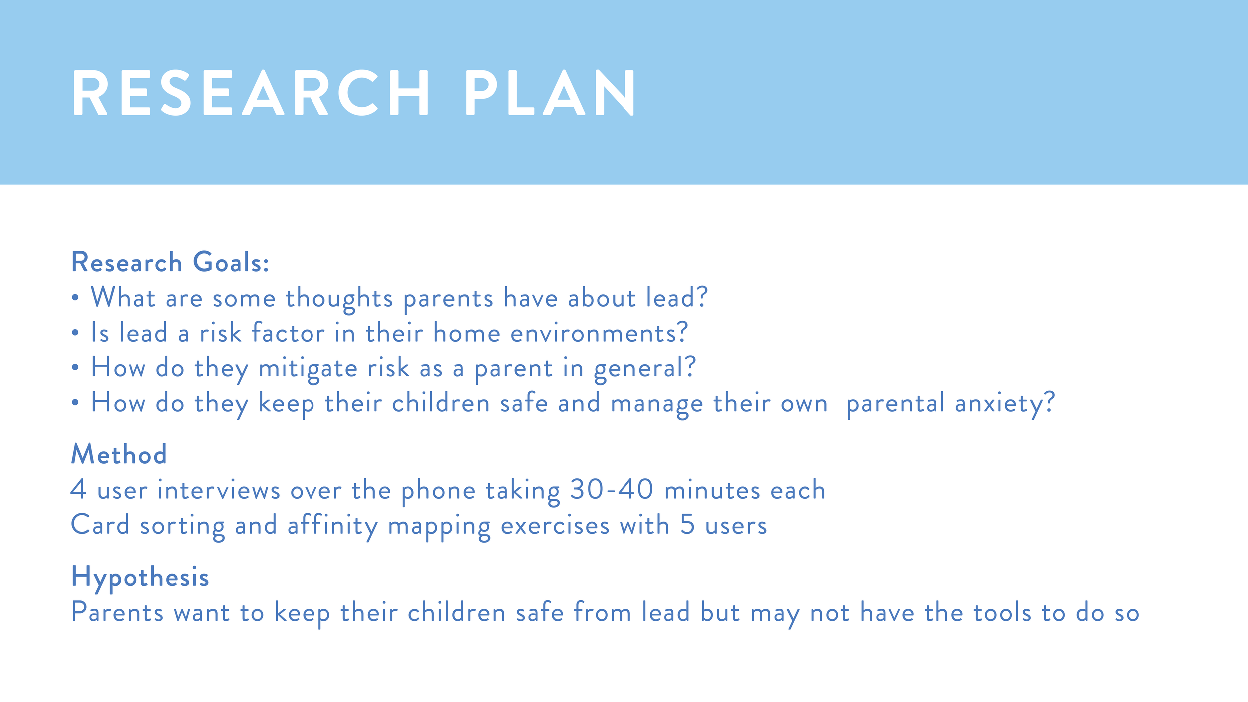
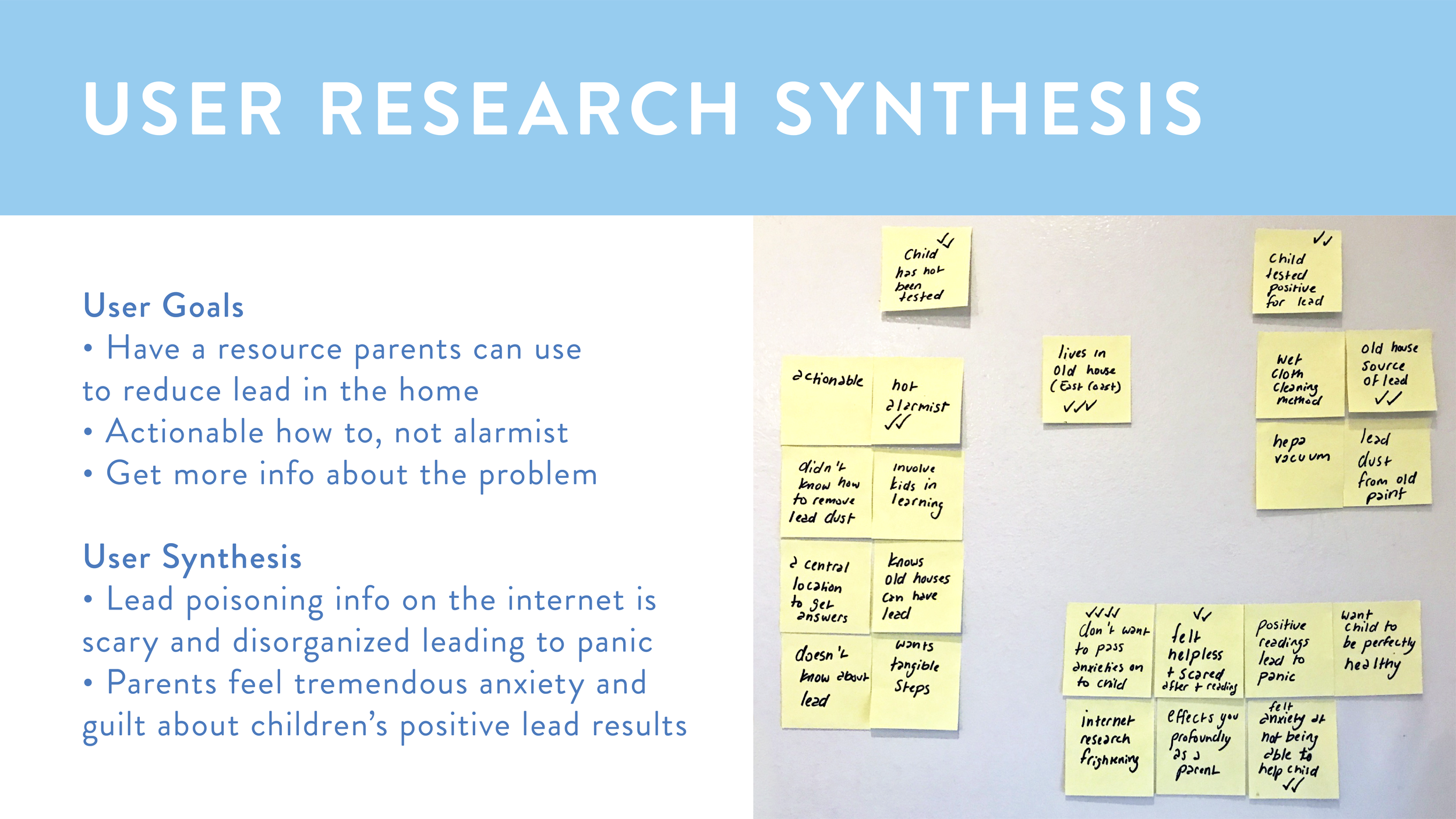
To un-cover user needs and pain points, I interviewed several parents to find out about their thoughts on lead, and how they reduce hazards in general. I was surprised to learn that two of the parents I interviewed had children test positive for lead exposure.
Hearing about their ordeals and the emotions they went through helped shape the tone of the app- I wanted to make something that would be comforting during very stressful times, as well as pragmatic and actionable.
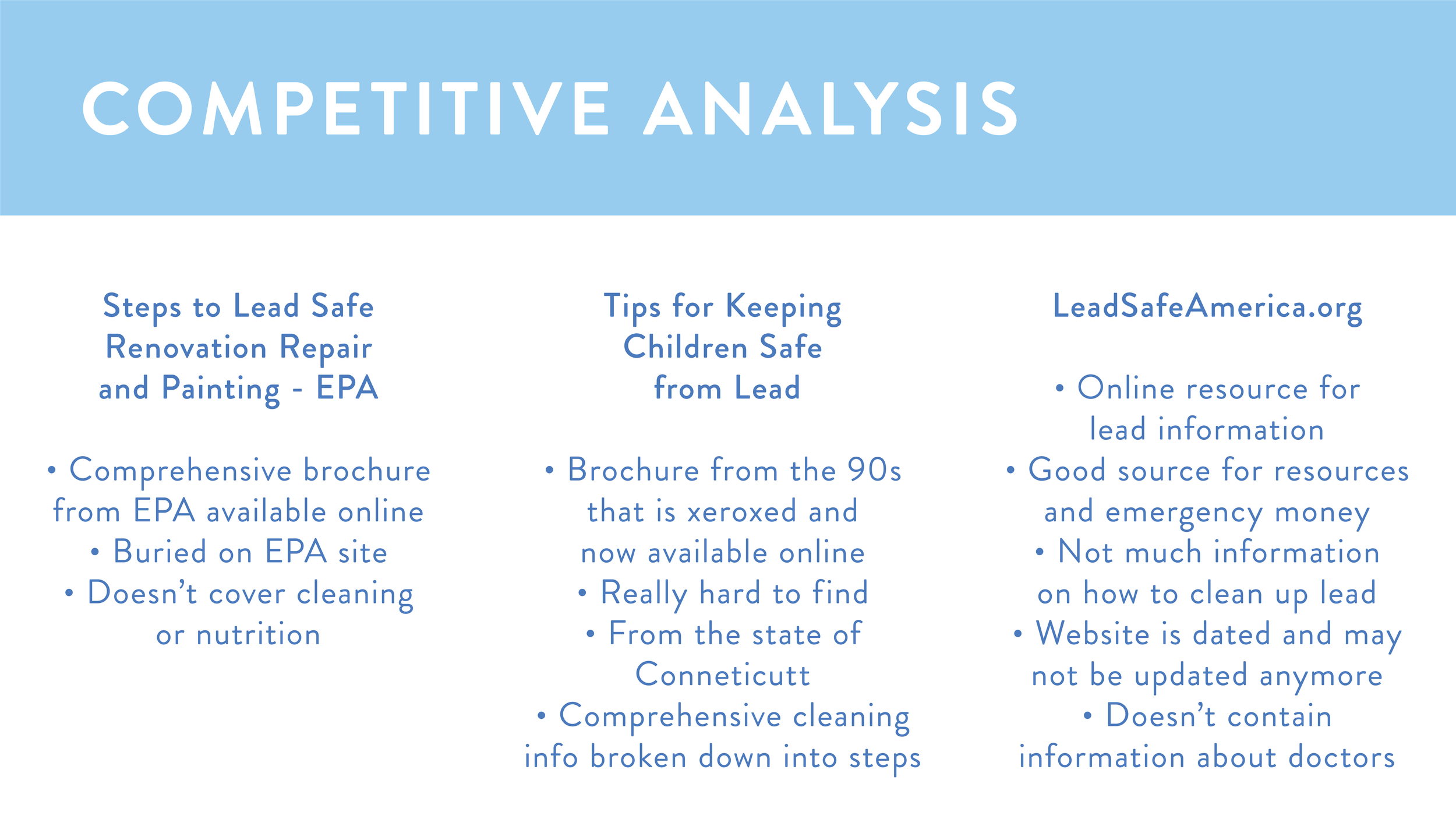
After researching lead reduction methods, I gathered information from cleaning guides published by the EPA and state governments about how to reduce lead dust in the home.
I added more features that parents had requested, like a way to connect with others who are similarly effected. I conducted a card sorting exercise to see how users would logically group the information.
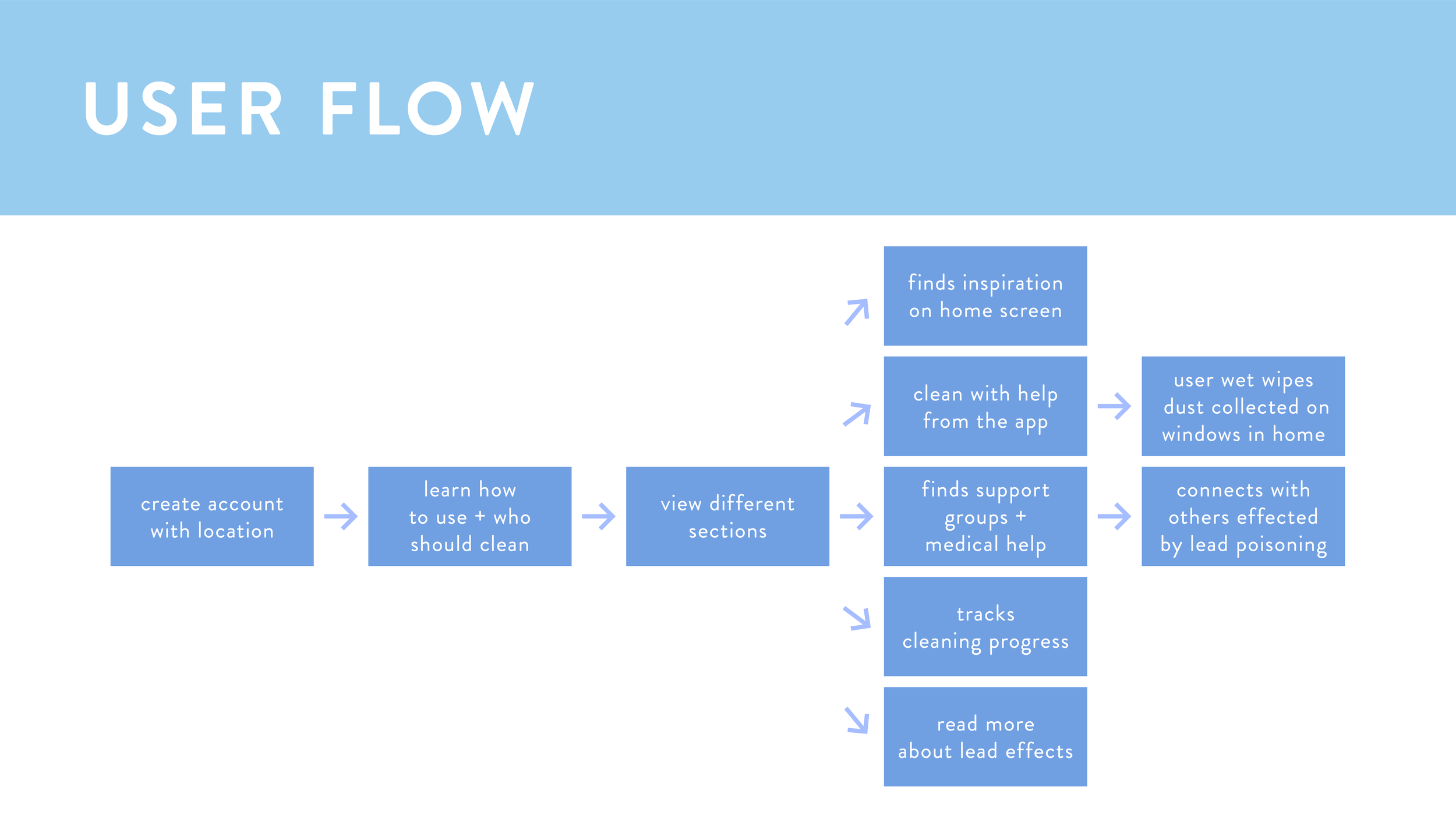
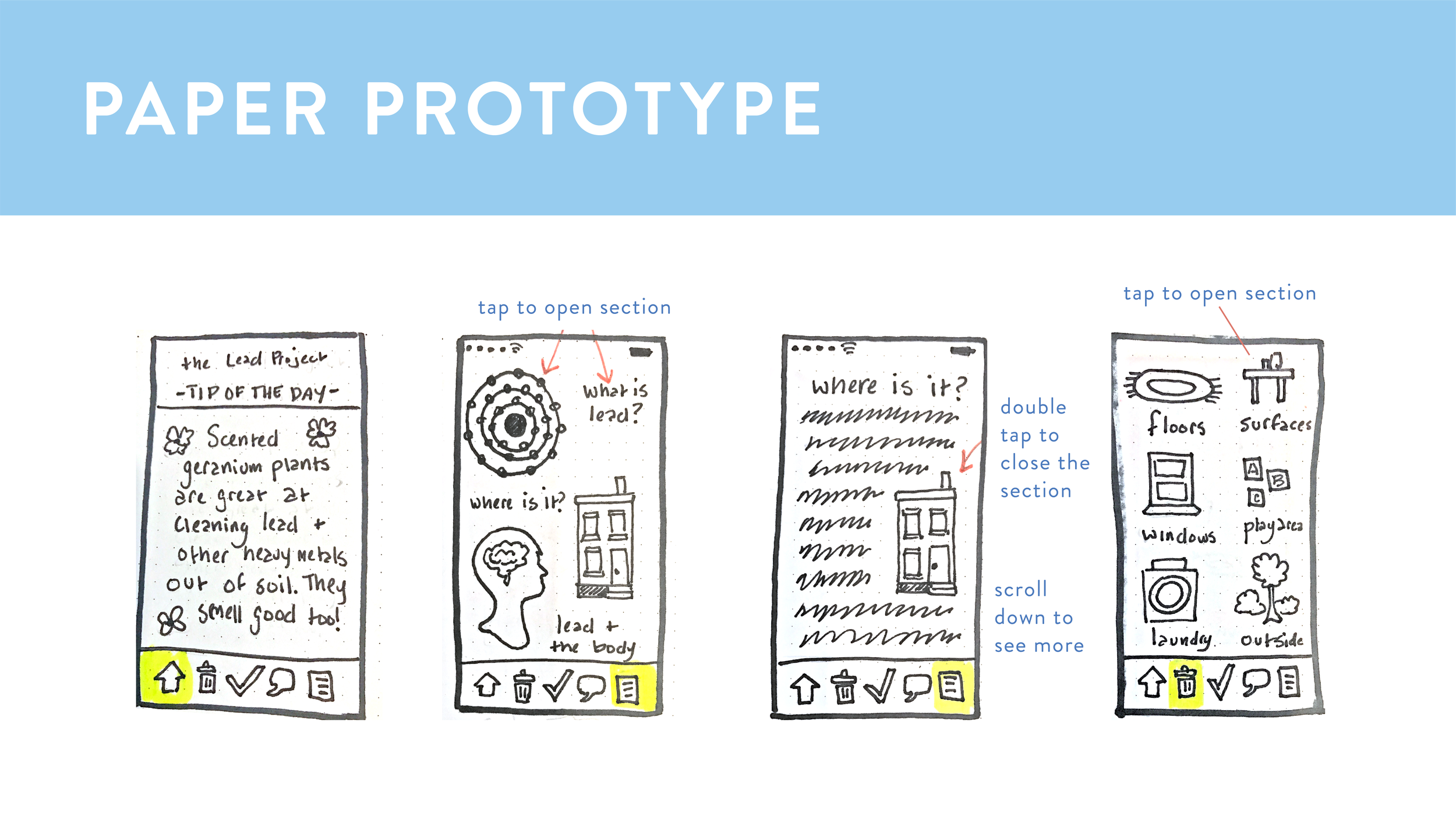
After putting everything together, I came up with my first wireframes. Then I tested with users, and after hearing feedback, I modified the user flow to be more dynamic and engaging.
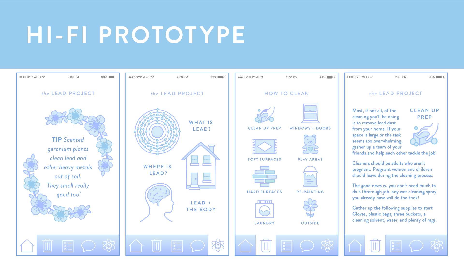
App Features:
The app contains a step by step house cleaning guide that is based on EPA guidelines to reduce lead dust in every room in the house.
Parents can make weekly checklists to stay on top of recurring tasks and keep track of their progress. It also has an educational section about the dangers of lead, and parents can connect with others nearby.
Roles:
Product development, UX and illustrations by Julia Hall
General Assembly instruction and guidance from Will Tyner and Wei Liao
Parents interviewed: Esther Rowan, Jennifer Ross, Tamara Aeschliman, Amy Garcia
Card sorting participants: Christine Leggio, Anu Sharma, Alissa Cheatham and Jason Aeschliman
Additional feedback from GA cohort 49
Navigation icons by Prithvi (Science) and Logan (Home, Chat, Delete, and List) from the Noun Project
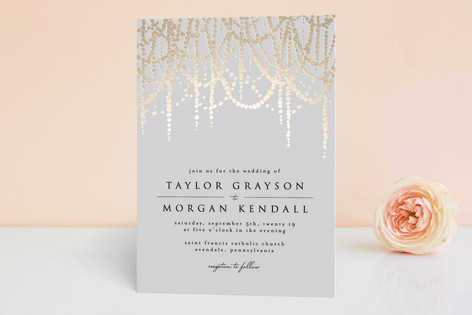
Coastal Paperie is a stationery line specializing in chic typography and custom illustrations. View on the knot and online store.
Goals:
My business partner and I wanted to create an elegant and inviting visual identity that evokes spring weddings, with beautiful florals that compliment the hand drawn illustrations on the wedding invitations.
Target audience:
Couples looking for high quality stationery products.
Design Process:
After illustrating and creating the stationery designs, I began to develop the brand identity. I started with a soft, neutral color palette of white, dove gray, and blush to compliment a variety of different wedding suite designs without overpowering the designs themselves.
I collaborated with a photographer to develop a stock photo series we could reuse, then I composited different looks together to showcase each wedding invitation design, with close up shots as well as full suite layouts.
Outcome:
The new branding and art direction has helped to connect with more clients as well as form a partnership with the Knot.
Roles:
Art direction, photo compositing, illustrations and design by Julia Hall
Brand development, icons and color palette by Anna Ott and Julia Hall
Photography by Micheal Werner
This site was designed for a wooden boat builder to showcase his work
Goals:
Create an engaging site to attract new customers and expand the boat making business.
Target Audience:
Kayakers looking for well-crafted, custom boats
Design Process:
I collaborated with the small business owner to ensure the site was clean and straight forward, so that the beauty of the boats could shine through. I wanted to make sure the calls to action were clear, so anyone interested could connect easily.
Roles:
Site Design by Julia Hall
Photography by Tom Hall
Some my favorite projects from over the years
Icons for Decorating Game:
A playful group of icons for a hypothetical design game.
• • • • • • • •
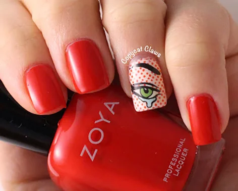
Nail decals:
I was inspired by the nail art wave in the early 2010s and started a nail decal business. It was a fun, free form creative process. I also got to do some cool side projects, like making fake nails for Paris fashion week, and Alex Trebek nail decals that a contestant wore on Jeopardy! (1:20ish minute mark in the video)
The decals were sold online and in stores throughout the US, UK, Japan, Australia and France.
Audience:
Tweens, teens, and women in their 20s and 30s
Roles:
Designs by Julia Hall
Photos courtesy of Firebox, Rad.co, DryDammit, Copycat Claws, and IWantShoes, City Kitty Rescue in Philadelphia
• • • • • • • •
Slaves of Christo chapbook:
A comedic exposé of what it was like to work for Christo and Jeanne-Claude, building the Gates project in Central Park in 2005. Received the AIGA Design Award, 50 Books | 50 Covers 2005.
Roles:
Written and illustrated by Chrissy Leggio and Julia Hall
Graphic design by Mark Wagner and Amy Mees
• • • • • • • •
Murals at Jay Cooke Elementary School
City Year Americorps project
Goals:
These murals were developed to beautify the school yard and encourage reading. The murals are based on Maurice Sendak's Where the Wild Things Are and Eric Carle's Very Hungry Caterpillar.
Roles:
Mural design and project management: Julia Hall
Painted by City Year corps members, Teva Pharmaceuticals volunteers, Jay Cooke student painters, Tiep Bui, Tony Harrington, Chrissy Leggio, Patrick Lindsey, Steven Putz, Stephan Tsapatoris, Jenny Ziller, Ashley Alexander, Alissa Cheatham, Anthony Pastelli, Abby Hartshorne and Julia Hall
Outcome:
A non-profit and private sector partnership was strengthened. Students also started holding an annual picnic near the murals.